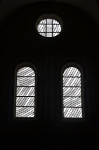
In Search of Austerity, I’ve found it. Twice really this weekend. First on saturday, the stained glass windows in the Abbey of Conques. They were a complete surprise. Created by the Frenchman Pierre Soulages, born in nearby Rodez, in 1915. Three years, at the age of 91, he created these fabulous stained glass windows in the abbey church.

They are about different shades of grey, really. Repeated in a pattern that is Romanesqe in style – taking the circular and rectangular shapes from the Roman columns – and then softened them in different tints of grey – or at others times of the day blue/white/yellow. Just to read about the meandering approach to his work that led to the design for his windows was a stimulating experience. I liked the windows when I saw them. I really appreciated them after reading a little bit more about them.
This is going to be a side comment, but I had to think of La Sagrada Famiglia in Barcelona. I have seen the church being developed over the past ten years, when, because of lots of Japanese money, the work progressed fast. I was very disappointed the last time I saw the church, at the beginning of june with Claire. All the idiosyncratic ideas of Gaudi were replaced by sterile computer programmes. Worst was that these computer programmes were repeated all over the cathedral. The same sculpted figure again and again in the ceiling, a repetition of the same design of stained glass. It was boring, in a way, although the delight of the unusual shape of columns and ceiling patterns was still a delight.
Back to Conques. Soulages used less colours. He was in charge of all the windows, just like the stained glass designer the Japanese hired at the Sagrada Famiglia. But in Conques not one window was the same, although it was difficult to define what was exactly different about each single window. It was delicate, and because it was delicate, it was delightful. It was austere. Austerity in optima forma
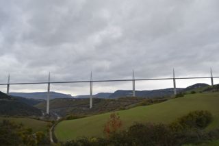
I had the same experience seeing the Norman Foster bridge in Millau. Julie and I deliberately did not drive over the bridge, but under it, so that we would be able to admire it. The journey was breathtaking. The bridge got closer and closer. Of course it is enormous. The Eiffel tower fits under one of its pillars, almost. But from a distance one doesn’t see that. One sees seven pillars to the ground, gently broken up in two halves in a way that doesn’t harm to the basic structure. Then there is a horizontal stripe in the sky, the road, and above there the wingshaped forms of steel cabled suspension bridges that we have gotten used to over the years.
Wow. It all looked marvellous. It seemed that not a single amount of steel or concrete was wasted .It all was back to elementary form, just like St Bernard would have wanted it. And the end result was splendid. Austerity leads to perfection, by seeking originality instead of repetition, just like it has at the past.
Julie and I stopped at an information centre about the bridge and looked at a video about the building of the bridge. Julie sat behind me and asked after a while if I needed a hanky to dry my eyes. I did need a hanky indeed, but just because to dab away the water that was dripping down the edges of my mouth.
What a splendid achievement. Both the windows and the bridge really. Although I was looking for 12th century austerity during this journey, I seemed to have found it in these two examples of 21st century design. It is about simplicity, but defining this simplicity in the unique circumstances of the particular situation. The way the sun passes through the day at Conques, the way the valley was shaped at Millau. Humans can deal with these things with a whisper, not with a shout. That’s what austerity is about. What a marvel it was to witness it.


Han says
“Humans can deal with these things with a whisper, not with a shout.”
Beautifully written. And a noble cause to strive for in one’s life, I think.
Patrick says
I like the story about how the bridge was build to speed things up but in the end travelling across the valley took longer as car drivers slowed down to admire the views. Wonderful irony.
Shelly says
This is like beautiful poetry, Joost! Thanks for painting the picture in my mind!
Nigella says
Awesome, you have have inspired me to visit and have a look one day.
Nigella says
Hi there Han
I also love Joosti’s comparisons with human life, seeing in the austerity of the bridge design the comparisons with how we can conduct ourselves “austerely” yet still create wonderful things.
The word “austere” generally has negative connotations, with a sense of going without things and making do, grey and sombre. Perhaps that is not right.
Han says
Hi Nigella,
Wasn’t it Goethe who wrote: “In der Beschränkung zeigt sich der Meister”/”in moderation is the master revealed ” (there the smart ass is again, or: Google is your friend ;-). I see austerity as an avoidance of excess, in life as in work. Not to say that I can live up to it, though …